Latest Blog Don’t Buy the Dip Yet! Here’s How to Play the Top 10 Stocks in a Volatile Market
Don’t Buy the Dip Yet! Here’s How to Play the Top 10 Stocks in a Volatile Market
In this detailed guide, we dive into the world of stock market pullbacks, focusing on the top 10 most popular stocks. With recent volatility and the end of Q2 earnings, it's crucial to understand how to protect your investments and wait for the right moments to buy. Our expert analysis covers key support levels, potential pullback zones, and strategic insights to help you navigate these turbulent times.
Navigating Market Pullbacks – A Guide to Patience and Protection
Welcome back to our blog, where today, we dive into the pulse of the market through a closer look at some of the most popular stock and index charts. 📉✨
As we approach the mid-year mark, it’s crucial to adopt a cautious stance, especially with the recent completion of Q2 earnings and the typically quieter Q3 on the horizon. From June to October, we often witness a volatile or sideways market, with many traders and investors left pondering the best moments to make their moves.
In this article, I’ve spent the last four hours meticulously analyzing ten of the most influential charts, focusing on potential pullback scenarios. My aim is to provide you with insights that help you protect your capital and avoid premature entries in a market that might not yet be ready for its next big leap.
The Key Takeaways:
Protect Your Capital: Understanding where potential pullbacks may occur can save you from entering positions too early. By waiting for confirmation of market strength, you ensure your capital is better protected.
Patience Pays Off: With Q3 often less significant until the end-of-year Q4 rush, now is the time for patience. The market’s next all-time highs are likely to emerge closer to the year’s end when forecasts are clearer and achievements align.
Volatility Ahead: Expect a mix of volatility and sideways movement during the summer months. This period can be a test of endurance and strategy, setting the stage for more significant opportunities in the fall.
Our Focus:
We’ll be examining Tesla, Nasdaq 100, Microsoft, AMD, Robinhood, Taiwan Semiconductor, NVIDIA, Meta Platforms, S&P 500, and Broadcom. Each chart is dissected to highlight where key support levels might hold or where further downside could be expected. By identifying these critical zones, we aim to give you a roadmap through the turbulent summer months ahead.
Thank you for joining me in this deep dive. I hope you find these insights valuable and that they help you navigate the upcoming market conditions with confidence.
Let's dive in!
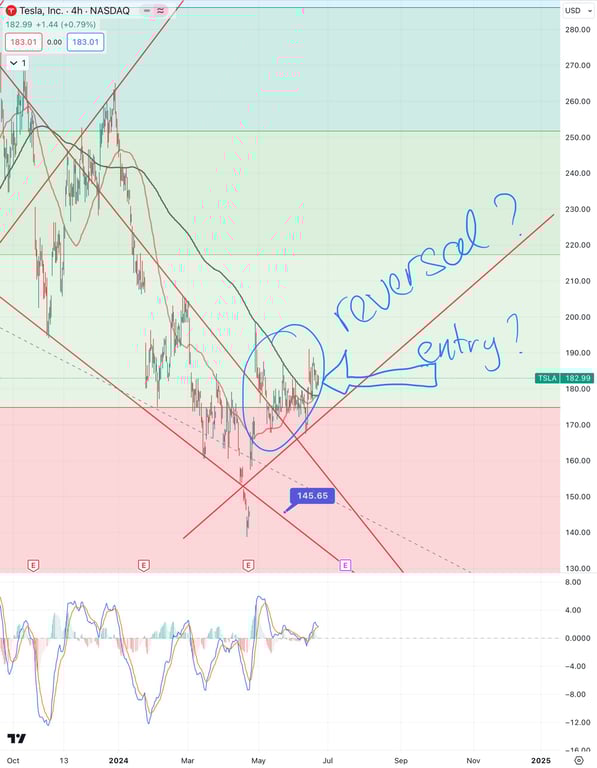
1. Tesla Stock (TSLA)
Chart Analysis: Tesla, Inc. (TSLA)
Fib Drop Levels:
270: 📉 This is the highest point before the significant decline, indicating a major resistance level where the price began its downtrend.
145: 📊 This level represents a critical support where the price found a strong bounce, marking a potential bottom before the recovery phase.
183: 🔄 The current price area around $183 is a focal point for potential reversal, as the price is consolidating here and has crossed above key resistance and moving averages.
Potential Reversal Signal:
The chart shows a possible trend reversal at the $183 level. This is highlighted by the price breaking above a descending trendline (red line), suggesting the downtrend might be coming to an end. Additionally, the annotations on the chart hint at a bullish outlook ("reversal?" and "entry?") if the price continues to hold above this level.
Moving Averages Interaction:
The black and red lines represent different moving averages. Recently, a crossover appears to be forming, which is often interpreted as a bullish signal. This crossover, combined with the price breaking above both moving averages, strengthens the argument for a potential trend reversal.
Momentum Analysis:
The MACD at the bottom indicates a bullish divergence, where the momentum is shifting upwards despite the price having been in a downtrend. This suggests that the downward pressure might be weakening, providing further support for a potential upward move from the current level.
Summary:
The Tesla chart shows promising signs of a potential trend reversal around the $183 level, supported by key Fibonacci levels, a possible bullish moving average crossover, and a weakening of downward momentum as indicated by the stochastic oscillator. This makes the current level an interesting point for considering a long position, provided the price continues to show strength above the $183 mark.
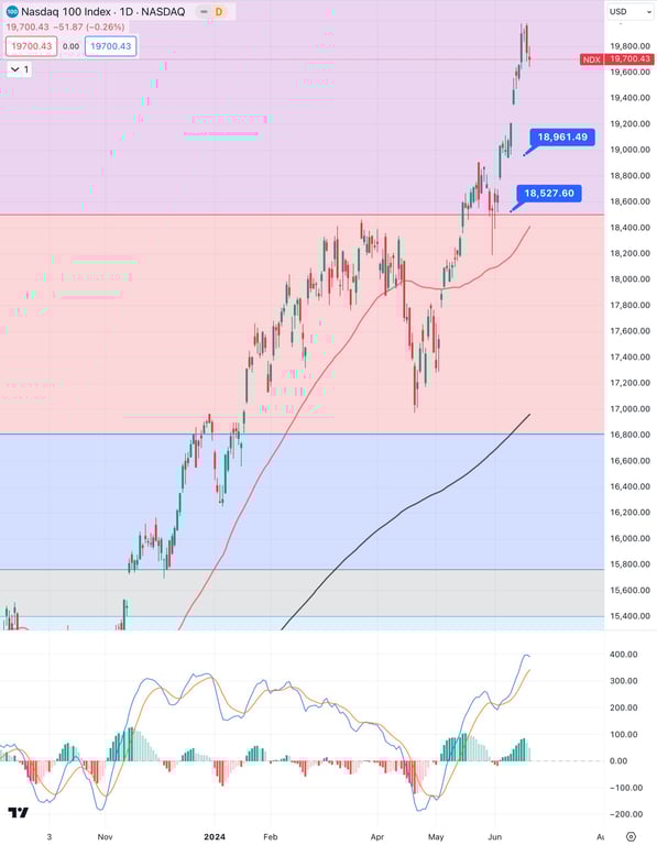
2. Nasdaq 100 Index
Chart Analysis: Nasdaq 100 Index (NDX)
Fib Drop Levels:
19,700: 📉 This level marks the recent peak and acts as a significant resistance. The price has reached this level after a strong rally.
18,961: 📊 An intermediate support level that aligns with a previous consolidation phase and is crucial for maintaining the upward trend.
18,527: 🛠 A key support level where the price previously rebounded, reinforcing its importance as a foundational support in case of a pullback.
Current Uptrend:
The Nasdaq 100 is currently in a strong uptrend, evidenced by the higher highs and higher lows pattern. 📈 The price has recently broken above previous resistance levels, establishing new highs, indicating strong bullish momentum.
Moving Averages:
The red line (likely a short-term moving average) is significantly above the black line (likely a long-term moving average), illustrating a healthy bullish trend. 📊 The distance between these averages suggests strong upward momentum, with the shorter-term average providing dynamic support.
Momentum Indicators:
The MACD at the bottom shows bullish momentum with the histogram and signal lines both in positive territory. 🔍 However, there's a slight decline in momentum as the price approaches the $19,700 resistance, suggesting potential for a short-term consolidation or pullback.
Summary:
The Nasdaq 100 Index is in a robust uptrend, making higher highs and currently testing the $19,700 resistance level. The chart highlights the importance of the $18,961 and $18,527 support levels, which could provide buying opportunities if the index pulls back. The moving averages support the bullish trend, while the MACD indicates ongoing but potentially weakening momentum as it approaches the resistance.
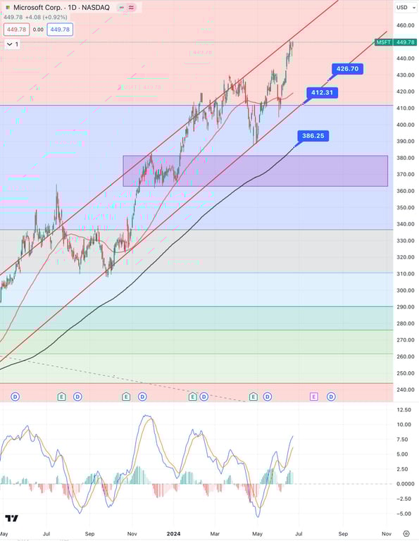
3. Microsoft Stock (MSFT)
Chart Analysis: Microsoft Corp. (MSFT)
Fib Drop Levels:
426.70: 📊 This level represents a potential support point within the current rising channel. It aligns closely with the lower boundary of the trendline and could act as a support if the price pulls back.
412.31: 🛠 Another significant support level, closer to a previous consolidation zone. This level could provide strong buying interest if the price tests it.
386.25: 🔧 This is a deeper support area and a critical level that aligns with the 50-day moving average (red line), adding additional strength to this support.
Rising Channel:
Microsoft is trading within a well-defined rising channel, as indicated by the red parallel lines. 📈 This suggests that the stock is in a sustained uptrend, consistently making higher highs and higher lows.
Support and Resistance:
The price is currently near the upper boundary of the rising channel, facing resistance around the $450 level. 📉 This could imply a potential pullback towards the lower boundary of the channel or towards one of the support levels mentioned above.
Momentum Indicators:
The MACD at the bottom shows that the stock is nearing overbought territory. 🔍 This suggests that the stock might experience a short-term pullback or consolidation before resuming its upward trajectory.
Summary:
Microsoft's stock is exhibiting strong upward momentum within a rising channel. The price is near the upper resistance of this channel, and the stochastic indicator hints at possible overbought conditions. Key support levels to watch in case of a pullback are $426.70, $412.31, and $386.25, which align with trendline support and the 50-day moving average.
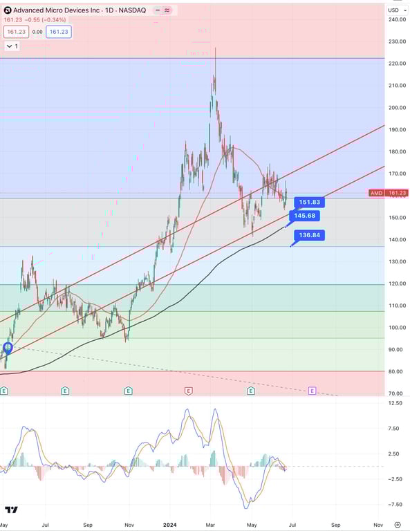
4. AMD Stock ($AMD)
Chart Analysis: Advanced Micro Devices Inc. (AMD)
Fib Drop Levels:
151.83: 📊 This level acts as immediate support and is crucial for the stock to maintain its recent gains. It coincides with the lower trendline of the upward channel.
145.68: 🛠 A stronger support level where the price could find significant buying interest if it pulls back from current levels. This aligns with previous lows and the lower boundary of the channel.
136.84: 🔧 A major support area and potential lower boundary for a deeper pullback. This level is just above the 200-day moving average (black line), making it a critical support.
Channel Boundaries:
AMD is trading within a broad upward channel, indicated by the red parallel lines. 📈 This suggests a continuation of the upward trend as long as the price remains within these boundaries. Currently, the stock is near the lower boundary of this channel, potentially offering a buying opportunity if it holds.
Support and Resistance:
The price is consolidating around the $161 level after a recent pullback from highs near $200. 📉 The $151.83 and $145.68 levels are crucial supports to watch for any potential downward movement, while resistance is observed around $170 and $180, which could be targets if the price rebounds.
Momentum Indicators:
The MACD (Moving Average Convergence Divergence) at the bottom shows a bearish signal, with the MACD line crossing below the signal line and the histogram turning negative. 🔍 This indicates weakening momentum, suggesting a possible short-term downside before any potential rebound.
Summary:
AMD is currently trading within an upward channel, showing signs of consolidation near the lower boundary of this channel around the $151.83 and $145.68 support levels. The stock needs to hold these levels to maintain its upward momentum. The MACD indicator suggests that the current momentum is weakening, potentially leading to a further pullback towards these support levels before any significant rebound.
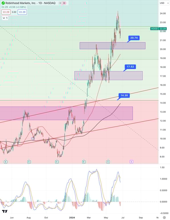
5. Robinhood Stock (HOOD)
Chart Analysis: Robinhood Markets, Inc. (HOOD)
Fib Drop Levels:
20.74: 📊 This level is the nearest support where the price is likely to find buying interest. It's a crucial zone that aligns with previous consolidation.
17.52: 🛠 A significant support level that held during the previous correction. This aligns with a strong horizontal support zone, making it a key area to watch if the price declines further.
14.30: 🔧 A deeper support level, which is critical as it marks the lower boundary of a previous range and aligns with the 200-day moving average (black line).
Recent Price Action:
Robinhood has experienced a sharp rally, pushing the price to a recent high of around $23. 📈 The stock has since started to pull back, testing support levels as it consolidates the recent gains. The price is currently consolidating just above the $20.74 level, indicating this area is acting as immediate support.
Support and Resistance Zones:
The $20.74 level is immediate support and is crucial for the stock to hold to maintain its upward momentum. 📉 Below this, the $17.52 level is the next significant support, which previously provided strong buying interest. Resistance is at the recent high of around $23, where sellers have stepped in.
Momentum Indicators:
The MACD at the bottom indicates that the stock is moving out of overbought territory, suggesting the potential for further consolidation or a minor pullback. 🔍 The divergence in the oscillator also hints at a possible weakening of upward momentum, which could lead to testing lower support levels.
Summary:
Robinhood Markets, Inc. is currently consolidating after a strong rally, with the $20.74 level acting as immediate support. The stock shows potential for further consolidation or a pullback towards the $17.52 support level if the momentum continues to weaken. The stochastic indicator suggests that the stock has recently been overbought and may continue to correct before resuming its upward trend.
I do this all for free and appreciate if you buy me a cup of KO-FI for all this hard work. LINK HERE… ☕
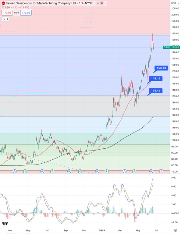
6. Taiwan Semi Conductor Stock (TSM)
Chart Analysis: Taiwan Semiconductor Manufacturing Company Ltd. (TSM)
Fib Drop Levels:
153.48: 📊 This level represents an immediate support that aligns with the lower trendline of the recent breakout, providing a potential area for price stabilization during pullbacks.
145.12: 🛠 A significant support level that marks the top of a previous consolidation range, making it a key level to watch for potential buying interest if the price declines further.
135.45: 🔧 A deeper support level that coincides with the 200-day moving average (black line), offering strong support from long-term buyers.
Strong Uptrend:
TSM has been in a robust uptrend, making higher highs and higher lows. 📈 The stock recently broke out of a consolidation phase and is currently trading near its recent highs around $180. The sharp upward movement indicates strong bullish sentiment and momentum.
Support and Resistance:
The stock is facing resistance around the $180 level, where it has started to pull back slightly. 📉 Key support levels to monitor are $153.48 and $145.12, which could provide entry points for buyers if the price continues to retrace.
Momentum Indicators:
The MACD at the bottom shows that the stock is in overbought territory, suggesting that the recent uptrend might be overextended. 🔍 This overbought condition could lead to a short-term correction or consolidation before the next move higher.
Summary:
Taiwan Semiconductor Manufacturing Company Ltd. (TSM) is in a strong uptrend, with the stock recently breaking out and reaching new highs near $180. The stock is currently facing resistance and may pull back to key support levels at $153.48 and $145.12. The stochastic oscillator indicates that the stock is overbought, suggesting a potential for short-term consolidation or a pullback before resuming its upward trajectory.
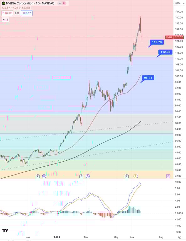
7. Nvidia Stock (NVDA)
Chart Analysis: NVIDIA Corporation (NVDA)
Fib Drop Levels:
119.73: 📊 This level represents an immediate support following the recent pullback from the highs. It's a crucial point to watch as the stock consolidates its recent gains.
112.98: 🛠 A significant support level that aligns with the previous resistance turned support zone. This level could attract buyers if the price continues to correct.
95.43: 🔧 A major support area that coincides with the 200-day moving average (red line), offering a strong base for the stock if it undergoes a deeper correction.
Sharp Uptrend:
NVIDIA has been on a remarkable uptrend, with the stock making substantial gains over the past few months. 📈 The price surged to a high near $140 before experiencing a pullback, indicating strong bullish momentum but also suggesting a potential for overextension.
Support and Resistance:
The current resistance level is around $140, where the price peaked before the recent pullback. 📉 Immediate support levels to monitor are $119.73 and $112.98, which could provide entry points if the stock finds stability here.
Momentum Indicators:
The MACD (Moving Average Convergence Divergence) at the bottom shows continued bullish momentum, but the recent pullback suggests some cooling off. 🔍 The histogram is still in positive territory, but the decline indicates that the upward momentum is slowing, potentially leading to more consolidation or a pullback.
Summary:
NVIDIA Corporation is currently in a strong uptrend, but the recent pullback from the highs near $140 suggests that the stock may be undergoing a short-term correction. The key support levels to watch are $119.73 and $112.98, which align with previous breakout points and could act as strong support if the price continues to decline. The MACD indicates that while the momentum is still bullish, it is weakening, suggesting the possibility of further consolidation or a pullback before the next move higher.
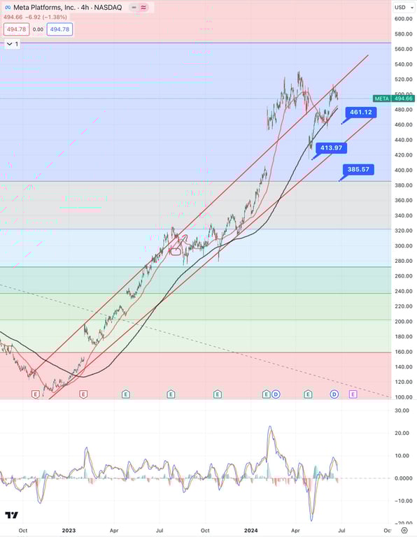
8. Facebook Stock (META)
Chart Analysis: Meta Platforms, Inc. (META)
Fib Drop Levels:
461.12: 📊 This level serves as immediate support, coinciding with the lower boundary of the current rising channel and a previous resistance level, which now acts as support.
413.97: 🛠 A significant support level that aligns with the lower trendline of the long-term rising channel and provides a strong base for potential pullbacks.
385.57: 🔧 This deeper support level is crucial, as it aligns with the 200-day moving average (black line) and the lower boundary of the previous consolidation range, making it a key level for long-term stability.
Rising Channel:
Meta is trading within a well-defined upward channel, indicated by the red parallel lines. 📈 This suggests a continuation of the uptrend as long as the price remains within these boundaries. The stock is currently testing the upper boundary of this channel, indicating strong bullish momentum.
Support and Resistance:
The price recently hit a high near $520 before pulling back. 📉 The immediate support levels to watch are $461.12 and $413.97, which align with the lower trendline of the channel and previous breakout points. Resistance is at the recent high of around $520, where sellers have emerged.
Momentum Indicators:
The MACD at the bottom shows the stock is in overbought territory, suggesting that the recent uptrend might be overextended. 🔍 This condition could lead to a short-term pullback or consolidation before the next move higher, especially as it approaches the resistance level near $520.
Summary:
Meta Platforms, Inc. is currently trading within a strong upward channel, with the price testing the upper boundary near $520. The stock is showing signs of a potential pullback or consolidation as it is in overbought territory according to the stochastic oscillator. Key support levels to monitor are $461.12 and $413.97, which align with the lower boundary of the channel and previous resistance turned support levels. A pullback to these levels could provide buying opportunities in line with the ongoing uptrend.
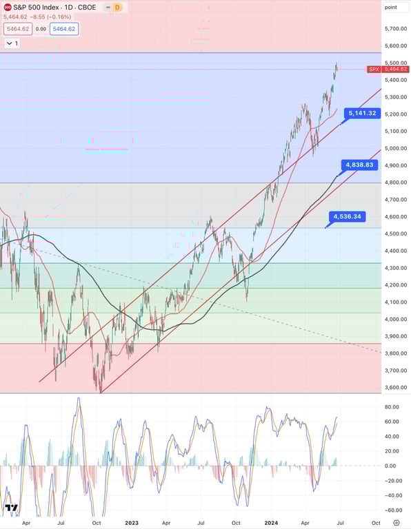
9. S&P500 Index
Chart Analysis: S&P 500 Index (SPX)
Fib Drop Levels:
5,141.32: 📊 This level represents immediate support, aligning with the lower boundary of the current uptrend channel and serving as a key area for potential buying interest during pullbacks.
4,838.83: 🛠 A significant support level, marking the previous breakout point and the 50-day moving average (red line), which could provide a solid base for the index if the price corrects.
4,536.34: 🔧 This deeper support level coincides with the 200-day moving average (black line) and a strong horizontal support area, offering a critical level for long-term stability in case of a more significant pullback.
Uptrend Continuation:
The S&P 500 Index is in a strong uptrend, making consistent higher highs and higher lows. 📈 The index recently reached a new high near 5,500, indicating robust bullish momentum. The upward trend channel (red lines) suggests that the current uptrend could continue if the price remains within these boundaries.
Support and Resistance:
The price is currently facing resistance near the 5,500 level, where it has recently peaked. 📉 Key support levels to monitor include 5,141.32 and 4,838.83, which align with the lower boundary of the channel and previous support areas. These levels could provide buying opportunities if the index pulls back.
Momentum Indicators:
The stochastic oscillator at the bottom shows that the index is in overbought territory, suggesting that the recent rally may be overextended. 🔍 This condition could lead to a short-term correction or consolidation before the next move higher, particularly as it approaches resistance at 5,500.
Summary:
The S&P 500 Index is currently in a robust uptrend, with the price reaching new highs near 5,500. The index is showing signs of being overbought, as indicated by the stochastic oscillator, suggesting that a short-term pullback or consolidation might occur. Key support levels to watch during a potential pullback are 5,141.32 and 4,838.83, which align with the lower boundary of the rising channel and previous breakout points. Maintaining above these support levels would be crucial for the continuation of the uptrend.
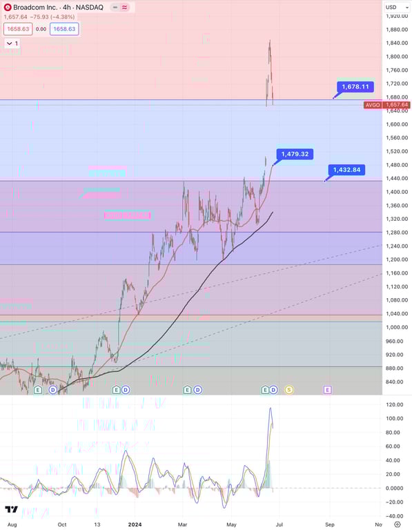
10. Broadcom Stock (AVGO)
Chart Analysis: Broadcom Inc. (AVGO)
Fib Drop Levels:
1,678.11: 📊 This level marks the immediate support, which the price recently fell below after reaching new highs. It serves as a critical level to watch for potential stabilization and buying interest.
1,479.32: 🛠 A significant support level that aligns with a previous resistance zone turned support and the 50-day moving average (red line), offering a key area for potential pullbacks.
1,432.84: 🔧 This deeper support level coincides with the 200-day moving average (black line) and represents a strong base for the stock in the event of a more substantial correction.
Recent Price Action:
Broadcom recently experienced a sharp rally, pushing the price to a high near $1,850 before pulling back. 📉 This sudden drop below the $1,678.11 support suggests a possible overextension of the rally, with the stock now entering a consolidation phase or a correction.
Support and Resistance:
The current pullback indicates that the stock is testing lower support levels after a rapid ascent. 📉 Immediate support levels to monitor are $1,678.11 and $1,479.32. Resistance is observed at the recent high near $1,850, where selling pressure emerged.
Momentum Indicators:
The MACD at the bottom shows that the stock is exiting overbought territory, suggesting the recent rally may have been overextended. 🔍 The indicator’s sharp decline supports the potential for continued short-term correction or consolidation as the stock searches for stability around lower support levels.
Summary:
Broadcom Inc. is undergoing a sharp correction after reaching a high near $1,850. The immediate support level to watch is $1,678.11, followed by $1,479.32, which aligns with previous breakout points and moving averages. The stochastic oscillator indicates that the stock was overbought, and its recent pullback suggests that the stock may continue to consolidate or correct to lower support levels before resuming its upward trend.
I do this all for free and appreciate if you buy me a cup of KO-FI for all this hard work. LINK HERE… ☕
Conclusion
I hope all this is useful. I am being more pessimistic than optimistic for this short-term reversal to ensure everyone goes into capital preservation mode. Overall I am as always bullish for the tech sector, but the over-extension from the last 4 weeks can be wiped out in 5 days if not careful. For Dip-Buyers - Hang on a little more before going in.
This blog post is for informational purposes only and does not constitute financial advice. The views and opinions expressed in this post are solely my own and are based on my personal analysis and experience. All information is provided on an as-is basis, and while I strive to ensure accuracy, I make no guarantees regarding the completeness, reliability, or accuracy of the information provided.
Investing in stocks and financial instruments involves risk, including the potential loss of principal. Always conduct your own research and consult with a qualified financial advisor before making any investment decisions. This blog is intended as a personal journal to document my thoughts and strategies, and should not be taken as a recommendation to buy or sell any securities.
By reading this blog, you acknowledge that I am not responsible for any investment decisions you make based on the information provided here. Please exercise due diligence and consider your own financial situation and goals before making any investments.
Discover strategic investment recommendations and key stock picks to enhance your portfolio in a low interest rate environment, leveraging insights from BuyTrigger.io.
Investors eyeing Nvidia, but is now the right time to buy? 🤔 Analysts point to a potential pullback after recent highs, presenting a possible entry point at $914. Diversification key as market volatility looms. Avgo emerges as a contender with stock split potential. Stay strategic, stay informed. #investing #stockmarket